Our Latest Blogs
Our Solutions News Blog was envisioned to gather and share information from the very best to help you and your business to become more effective.
Our Solutions News Blog was envisioned to gather and share information from the very best to help you and your business to become more effective.

Marketing your business comes with a multitude of tools for your toolbelt. It’s critical to have digital elements, such as a website and social media accounts, but print collateral is equally important. In some cases, print marketing materials are considered more important than digital elements because some people don’t rely on the internet a lot for their everyday lives, which leaves print materials as their introduction to your business.
There’s something about putting your brand in people’s hands and giving them the chance to interact with it outside of your goods or services. You know you need to stand out but wonder if that’s even possible given that people have been using print marketing for hundreds of years.
The good news is that you don’t have to reinvent the print marketing wheel. Instead, you can put an original spin on what’s already been done. I know, because that’s what my team does. Here are a few things you can do to improve your print marketing collateral and better promote your business.
1. Take shape.
Many people almost always use standard shapes and sizes when it comes to print marketing materials. Instead, consider creating a piece in a unique shape or size to stand out. For example, a round business card will be easy to pick out among a stack of rectangle pieces. You could also use a shape that reminds recipients of your business, such as a camera-shaped business card for a photographer.
If you don’t want to change the entire shape of the product, you can use die-cuts to alter various elements. For example, these brochures for BMW have die-cuts on the covers to match the brand. The first is rounded to make the logo stand out, while the second is shaped like a car, which draws attention to them.
2. Use bold images.
A powerful image can make or break a design. Stock images are money-savers, but it’s important to choose images that make a statement. Select images to which people can relate, or show the benefits of your product or service. This will leave a larger impression on your audience instead of pictures of your product on a pretty landscape.
That’s what happened when we worked with a client to create a presentation folder with bold images. The images illustrate what customers can expect when they select this company to provide maintenance or janitorial services, whether it’s an impeccably kept, vibrant garden or floors so clean you can see your reflection in them. There was some information inside on the pocket of the folder, but overall, the company let the images tell the story.
3. Connect to digital.
Just because it’s print marketing material doesn’t mean you can’t add a digital element. In addition to your website URL, consider using a QR code that will send recipients directly to your website, provide them with a digital coupon or unlock some other special deal. The key is making sure your print design is compelling enough that customers want to see more.
Another option for combining print and digital is using a video folder. With a video folder, screens are placed on the cover or inside the folder. Not only does this merge both types of marketing, but it also allows customers to better interact with the brand. This is also great when you have a lot of information that might not fit in your folder. For example, a real estate agent could provide virtual tours of properties with the video and include other info inside the folder, such as tax information and blueprints.
4. Add texture.
There are two ways to add texture to your design — physically and visually. Embossing and debossing are great ways to do that. Embossing uses pressure to raise elements of the stock for a three-dimensional effect, while debossing is the opposite and uses pressure to depress elements of the stock. Both provide a textured element that recipients can see and feel.
A more cost-effective way to add texture is visually. You can use various colors or shades to make it look like your product has a wooden, leather or marble texture, for example, just as designer Candice Bondi did for Halo. The business cards and brochures look as if they were printed on various textures, such as marble, plastic or sand, making the recipient want to run their fingers over the surfaces.
5. Shine on.
Build on adding texture by using a coating. It will not only change how your piece feels but also give it some shine, depending on the coating you use. Gloss and semigloss coatings provide a luxurious luster, while a soft-touch coating feels like a smooth piece of velvet. You can cover the entire product or highlight specific elements, such as the company name or logo.
Coatings also can add protection to your product from water, fingerprints and tears. If you don’t think your piece needs to shine, you can use a matte coating and still get the same protection.
You don’t have to do all of these things to have great print marketing materials, but you can. Or, you can try one or two methods. At the end of the day, you know your audience the best and to what they will respond. The important thing is creating something you can be proud of and that will help grow your business.
Written By: Vladimir Gendelman / Source: Forbes
- - - - - - - - - - - - - - - - - - - - - - - - - - - -
Please contact us for free information, tips and assistance!
Direct mail vs email is arguably one of the longest standing debates in marketing, this could be down to the constantly evolving industry and it’s audiences..

Today 70% of consumers reportedly feel like they receive too many emails, something we can probably all empathise with. As our virtual inboxes reach the thousands we have less and less tolerance for email marketing.
As the digital industry grows the direct mail vs email debate takes a turn and the death of email marketing as we know becomes apparent. The average lifespan of an email is now just 2 seconds and brand recall directly after seeing a digital ad is just 44%, compared to direct mail which has a brand recall of 75%. Whilst digital media is still a crucial part of marketing we compare the statistics of direct mail vs email.
The evidence suggests we need to revaluate the way we use email, rather than thinking of it as a cheap form of marketing how we can utilise it’s strengths? If we continue to bombard customers we may risk alienating them. As the effectiveness of email marketing declines the response to direct mail is on the rise, and printed media becomes a more trusted form of consumer engagement. Looking at the strengths and weaknesses of each media it seems the rising popularity of direct mail could work to reinforce email, if used in the right combination, and may we suggest in moderation.

Source: Proactive Marketing UK
- - - - - - - - - - - - - - - - - - - - - - - - - - - -
Please contact us for free information, tips and assistance!
Spring Into Spring; With Print That Works... isn't just a concept; it's a reality that brings it all together both internally and with your customer. Talk to us about 'Concept to Solution' printing for a defined way to improve your business.
We recently received this feedback from Alexandra as we really appreciate their patronage and working together with them on their market communications and special projects printing.
"The Dominion Blue team goes above and beyond in an efficient manner to help us get our printing done. With countless last-minute adjustments, I can always rely on the sales and preflight team to get the job done. Fantastic customer service, great printing products, timely delivery and excellent communication"... Alexandra
- - - - - - - - - - - - - - - - - - - - - - - - - - - -
Please contact us for free information, tips and assistance!
Print throughout your business... isn't just a concept; it's a reality that brings it all together both internally and with your customer. Talk to us about 'Concept to Solution' printing for a defined way to improve your business.
“Dominion Blue recently helped us with a project that had a very short turnaround time and everything went seamlessly. They were the first printers to get back to me with a quote and were the only ones who could accommodate all of my requests in the timeline I needed.
When I saw the proofs, they looked even better than I had anticipated. I am really happy with the end result and the customer service was on point. Thank you!” ... Mikayla / SaxxUnderwear.com
- - - - - - - - - - - - - - - - - - - - - - - - - - - -
Please contact us for free information, tips and assistance!
"POP displays, short for point-of-purchase displays, offer many advantages to retail stores and business owners."
If your business is looking to invest in a highly-rewarding retail strategy, then POP displays are a great tool. It delivers a brief insight to your customers about the products of your business.
Currently, many product-based companies are working to build a brand name by making a positive impact on the mind of customers. They are fighting to acquire stand spaces and central positions at retail stores, trade shows, and exhibitions to generate awareness about their businesses and stand out in the consumer markets.
POP displays are a cost-effective marketing tool and promise the following benefits:
Bring A Store Within A Store
Making use of POP Displays in your retail marketing is just like getting your own store inside a store.
If you’re looking for effective tactics in 2020 to grow your business and promote its products, then you should think about point-of-purchase displays.
In a highly competitive environment, it is not an easy thing for brick & mortar stores to stay on top due to an increased demand for e-commerce shopping. Therefore, POP displays are an excellent option to gather more money from shoppers in retail stores.
POP displays trigger impulse buying patterns, offer you a chance to showcase items and give tough competition to your competitors.
Store-within-a-store or shop-inside-shop is a great idea to build a brand name, enhance business reputation, and appropriately position your products in the mind of consumers.
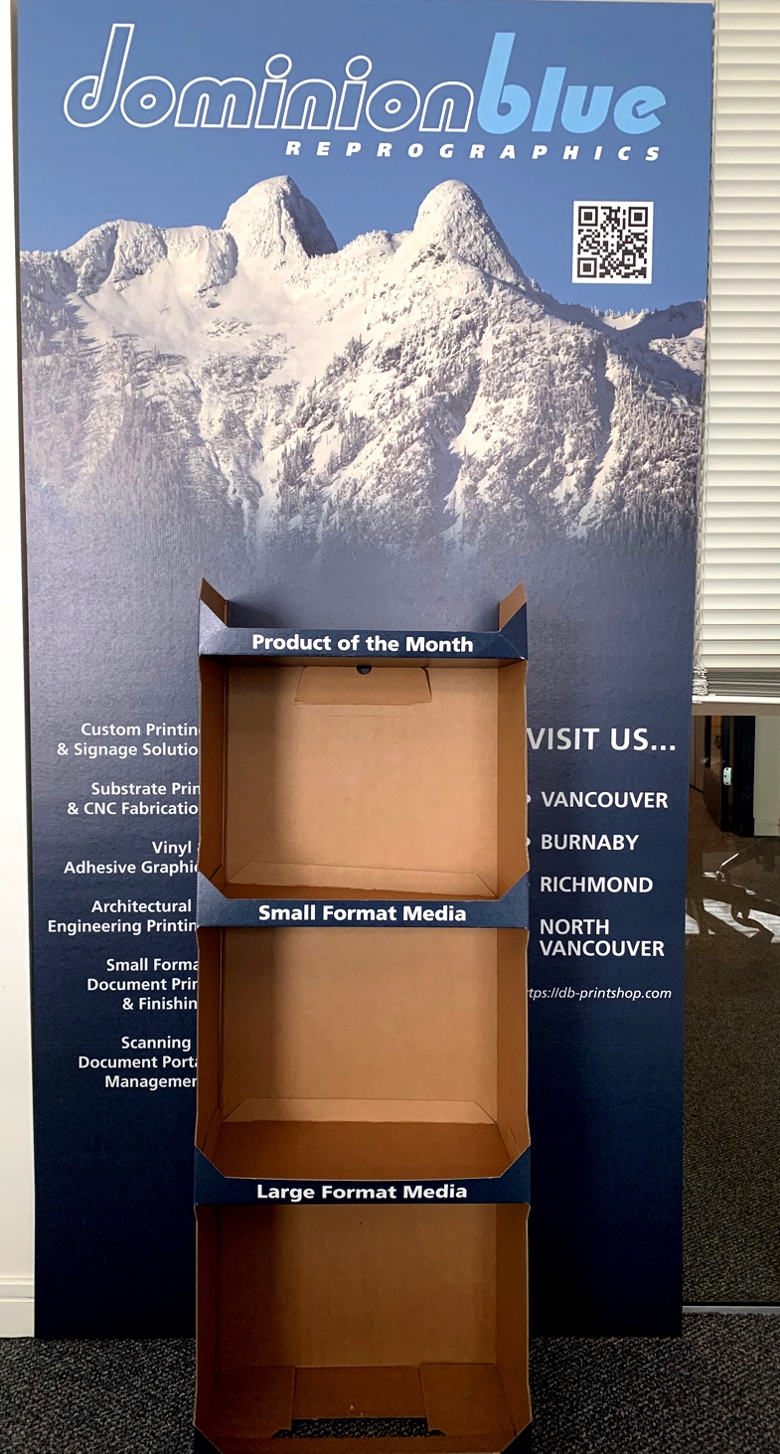
Draw Attention to Products
Have you always aimed to target a massive audience and promote your business products? If yes, then POP displays are a perfect solution to serve your needs.
It attempts to directly ramp up your sales volume. If you’re thinking “how?” Then, let me explain.
POP displays try to catch the customer’s eye when they are shopping for specific products in a retail store. With visually appealing POP displays, you can leave a significant impact on your shoppers with very little help.
Understandably, bigger mediums, such as suspension shelf signs and plastic modular displays are great to market your products, improve customer buying, and help notice your brand.
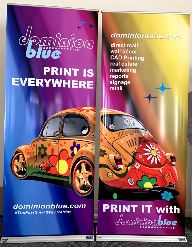
Strategically Locate Products
Point-of-sale displays are the attachments and free-standings that can be suitably placed on the shelves. This provides great flexibility to your retailers when it comes to marketing your brand and positioning your products in their retail stores.
Your products will no longer be squeezed or placed in the corners. There will be no such thing as putting your products on the low shelf.
Instead, it can be placed right in the middle of stores to attract customers’ attention. This is again a great technique to market your brand next to any complementary products.
Cost-Effective Marketing Idea
Understandably, in current times, marketing is essential in business to help you sell your products and ramp up sales volume.
The core purpose of marketing is to increase revenue and make more money. But, it is entirely impossible to generate more cash when you’re already spending so much money on expensive marketing tools.
Therefore, when it comes to promoting your business, your marketing team must consider cost-effective marketing ideas that can promise quality results. POP displays are one of the budget-friendly marketing ideas to encourage the sales of your products.
This technique is less pricey than getting an ad for your brand. POP displays effectively communicate your brand, just like publishing in a magazine and placing on a billboard, but obviously at less cost.
POP displays deliver the same ad or message by perfectly fitting in a retail store.
- - - - - - - - - - - - - - - - - - - - - - - - - - - -
Please contact us for free information, tips and assistance!
Source: Let's Reach Success Written By: Lidiya Kesarovska
Make Your Business and Brand Stand Out as you Welcome Customers Back....
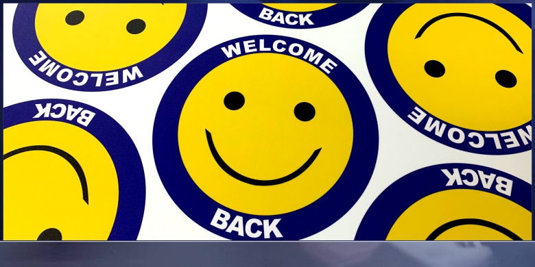
Welcome Them Back... with A Smile (Floor Grahics)
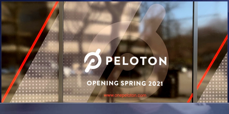
Welcome Them Back... Before You Open or Re-Open
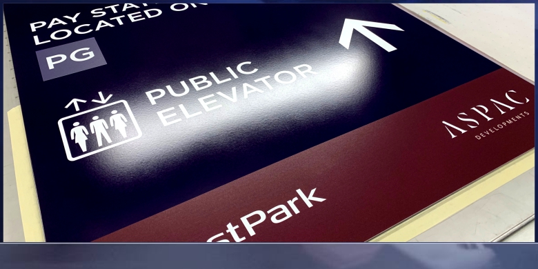
Welcome Them Back... with New Directional Signage
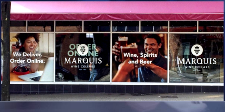
Welcome Them Back... with A Cheer
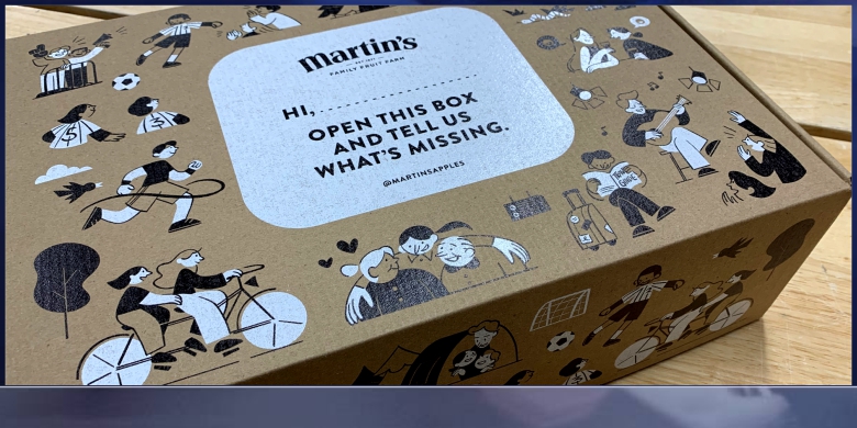
Welcome Them Back... with New Packaging
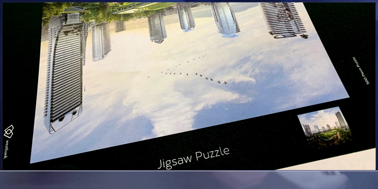
Welcome Them Back... with A Surprise
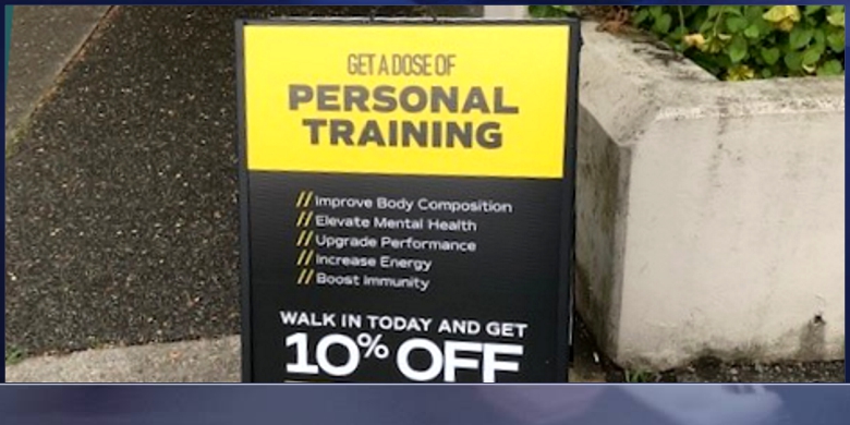
Welcome Them Back... with A Walk In Special
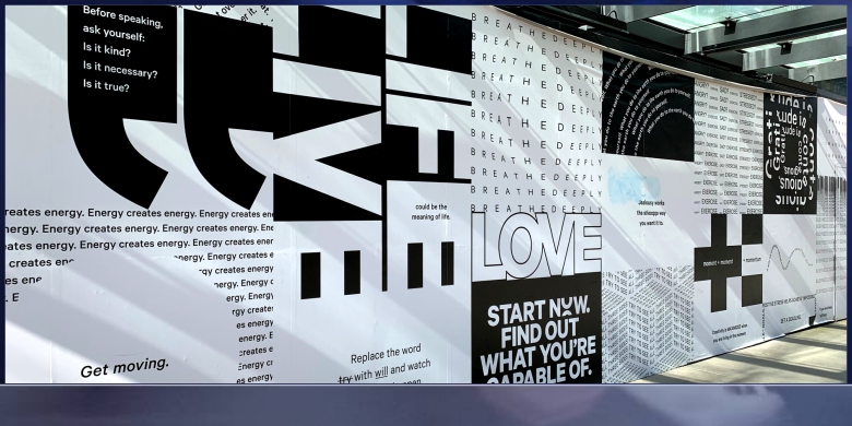
Welcome Them Back... with Your Offer

Welcome Them Back... with Mailed Information
Please contact us for free information, tips and assistance!
In retail environments, brands have just 3 seconds to make an impression on shoppers. Learn how to make sure your products catch buyers’ eyes.
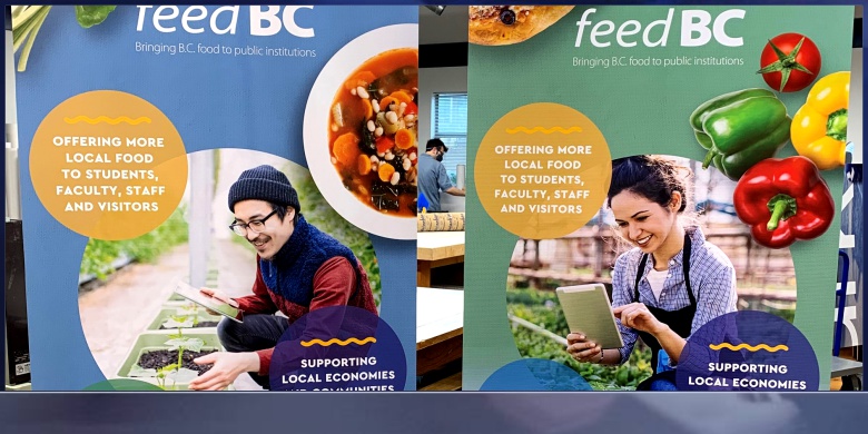
As consumers, we’ve all been there: staring at a shelf fully stocked with dozens of brands’ variations on the product we’re looking for — whether it’s lightbulbs for the guest bathroom, treats for the pup, or bottles of wine for a friend’s housewarming party. It’s overwhelming, isn’t it? Even if we thought we knew exactly what we wanted, the sheer number of options in front of us gives us pause — and the way the products are merchandised may draw our eyes (and our dollars) to a new brand. In fact, research from the Shop Association reports that consumers are exposed to 3,000 promotional messages per day and a whopping 80,000 items in a given grocery store visit. How do we choose?
And more importantly, how do brands ensure their products are the ones that catch our eyes?
It isn’t easy. The same report finds that a consumer’s decision to stick with their go-to brand or buy from a rival takes, at most, seven seconds — and those competing brands have just three seconds to make an impression.
The key to ensuring your brand stands out from the rest? Powerful point-of-purchase (POP) displays. These are the end caps, shelf talkers, display stands, and other types of signage that highlights a brand’s products in order to sell customers on its benefits and value right there in the store. To ensure your brand’s POP / POS displays make your products stand out among those 80,000 competitors, we recommend following these six steps.
1. Speak to Your Audience’s Needs
Consumers generally aren’t looking for products with certain specs or features; they’re looking for products that solve their problems. Maybe that’s eliminating a pain point or making their lives easier in some way; maybe it’s boosting their self-esteem or impressing others or simply adding joy to their lives. As you create your POP / POS signage, and particularly the messaging it conveys, don’t lead with the latest bells and whistles but with the intangible value your product offers customers.
Additionally, be sure to consider the customer’s entire experience. While, ideally, your target audience is already familiar with your brand from your digital, direct mail and other advertising tactics, the shopping trip offers yet another channel to meet and engage with potential buyers during the customer journey. To make your brand stand out, devise ways to engage with consumers from the parking lot into the shelf with branded signage, POP / POS materials, and product coupons.
2. Design for the Specific Retail Location
When you’re creating display materials for multiple outlets — even multiple locations of the same store — remember that not all retail locations are created equal. Retailers will have different rules and guidelines. These guidelines could be based on space constraints. An elaborate floor display that looks beautiful in a large suburban location is likely to be a tripping hazard in a smaller store tucked into a compact, urban area.
Differing rules may also be driven by local laws. No matter how beautiful the design or how powerful the message, a store display that isn’t compliant with regulations is simply a waste of money. Consider working with a marketing supply chain partner that’s well-versed in retail parameters and industry regulations to ensure every piece of in-store signage is compliant and display-ready.
3. Keep Longevity in Mind
A torn-up, worn-out display is a turnoff to customers, so as you design your POP/POS signage, do so with durability in mind. Whether it’s a temporary display for the holiday season or a permanent installation, you’ll want to ensure it looks great as long as you need it to. Will it survive transportation and storage in pristine condition? If it’s a product display will it support the weight of the products? Will it withstand in-store traffic, including shopping cart collisions or purse bumps?
Additionally, you’ll want to ensure the display is easy to restock. Shelf-talkers that get in the way of shelf access or endcaps that are too complicated to easily refill may look great at first, but as product dwindles, they may not get refilled as often as necessary, leading to missed sales opportunities. (Remember, too, that if a display is complex to restock, it’s probably hard for shoppers to access as well and they may pass it by.) A durable, easy-to-maintain display will showcase your brand in its best light for a long time.
4. Ensure Prime Placement in Store
The real estate adage, “location, location, location” applies to in-store signage and displays, too. Once you’ve invested in high-quality, beautifully designed marketing materials, it’s important to ensure those materials are displayed where customers will see them. For example, the Shop Association notes that the sweet spot for signage height is between shoppers’ shoulders and knees. A sign that’s close to the floor isn’t likely to be seen, nor is an in-aisle ceiling dangler.
Also consider unexpected places to grab shoppers’ attention. Research says six in ten in-store purchases are impulse buys, so it may pay to place your displays in strategic places to pique those impulses. Place your products near the cash register to inspire last-minute buys, or near items they pair will with to entice customers. (For example, showcase your salsa on the chip aisle or package your spirits with fun bar accessories and coupons for popular mixers.)
(Note: Make that prime placement easier for everyone involved by ensuring your signage is delivered on time and easy to assemble.)
5. Minimize Production Costs
With tight marketing budgets and high ROI expectations, it’s important to ensure the costs of the POP / POS materials don’t outweigh their value. A savvy marketing partner can help find ways to minimize costs without sacrificing quality or effectiveness. Some of the levers you may pull to streamline costs include material selection, manufacturing techniques and complexity of design. Choosing a partner that gangs orders through “buy windows” and has a proven network of production facilities helps maximize economies of scale, saves costs, and minimizes risk. Knock-down displays — the kind that are shipped disassembled or flat and popped up in store — can save significant costs on packaging and transportation. The more creative you and your partner can be about design, materials, shipping, and ordering windows — without sacrificing quality — the more valuable in-store marketing will be for your brand.
6. Follow Best Practices for POP Display Design
Finally, to create POP / POS materials with maximum impact, be sure to follow the design best practices that are most likely to catch shoppers’ eyes and encourage them to choose your product. Select bold colors that both showcase your brand and evoke the feelings (comfort, safety, impulsiveness, etc.) you want buyers to feel. Select unique shapes that will stand out on shelves and against other displays, and ensure any interactive elements are intuitive for shoppers. Keep your messaging clear, simple, and easy to digest — and be sure your brand logo is on full display. Above all, keep the audience’s needs and experience at the forefront of the design process.
Please contact us for free information, tips and assistance!
Written By: Casey Rush Source: One Touch Point Blog