Our Latest Blogs
Our Solutions News Blog was envisioned to gather and share information from the very best to help you and your business to become more effective.
Our Solutions News Blog was envisioned to gather and share information from the very best to help you and your business to become more effective.
Consumers need to be shown that something is good value by comparison, this can be done by developing strong Value-Added Propositions.

We can add value to our services without adding anything physically to what we are selling. The perception of value is created through different things such as – decent service and also the way we present our products or packages. You can add value by creating a strong relationship with your customer, so you become more of a critical friend. It costs us very little and yet many companies ruin relationships and have to sell all the harder as a result.
We can also increase value by helping our clients save money in other areas, or at the very least, point out where you offer value compared to competitors, which could be linked to your package, price or your ease of access. Think about how this translates online. Any product or service that is bought online, saves the customer from venturing outside their door, saving time and money, so why do we offer discounts as well? Of course, digital business is the order of the day in a Coronavirus world, but you should point this saving out in the right way and at the right time.
Value for money is entirely subjective – and will be perceived differently by each individual. We often hear the phrase ‘passing the value on to the customer’ without really knowing what it means. It is marketing speak, of course. It means either they are justifying a bigger discount or showing you what ‘Value for Money’ is being offered.
Consumers need to be shown that something is good value by comparison, this can be done by developing strong Value-Added Propositions.
For example, an advert may list ten ‘bullet points’ about a product. If we take these facts, and translate them into what they mean to the customer, the selling proposition becomes more powerful.
Air conditioning for your car does not translate as ‘enjoy a cooler drive’ – the true advantage is ‘you and your family remain cooler over long journeys, so you enjoy the journey more, have less complaints from children and arrive fresh and awake.’ This may sound like we are spelling it out, but in this time of hardship, buying decisions are made on quite literal translations from facts, into advantages. If we train our salespeople, customer service teams and their managers to understand this and speak with engaging language to potential clients, then the perception of adding value becomes a reality, even though we are giving away nothing more than we already did.
Ask Yourself:
Please contact us for free information, tips and assistance!
Written By: Jeremy Blake Source: Reality Training
Make Your Business and Brand Stand Out as you Welcome Customers Back....
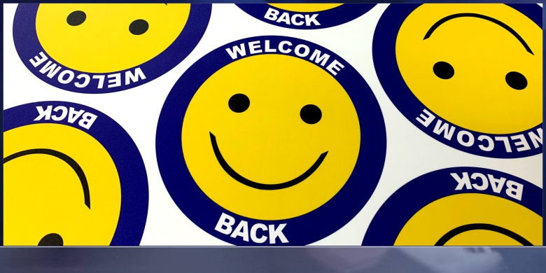
Welcome Them Back... with A Smile (Floor Grahics)
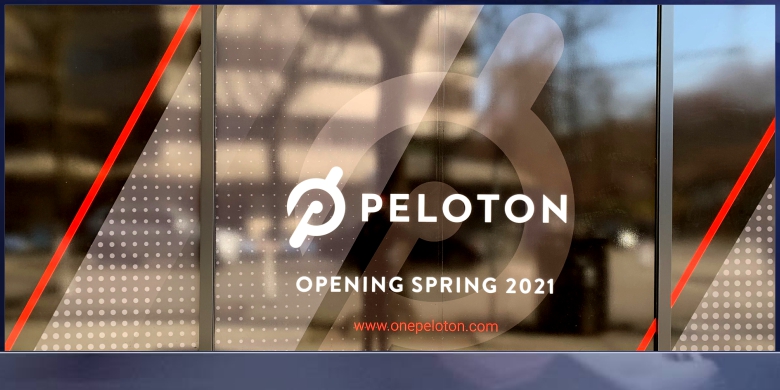
Welcome Them Back... Before You Open or Re-Open
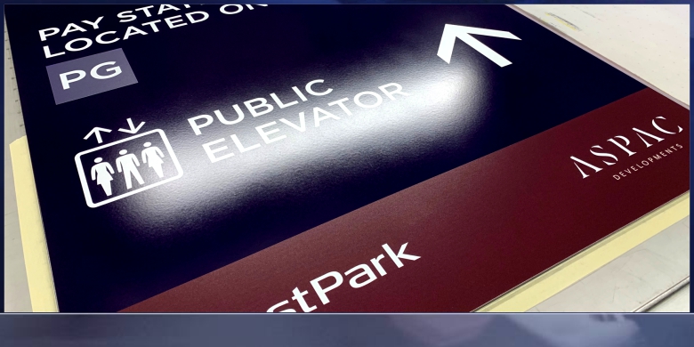
Welcome Them Back... with New Directional Signage
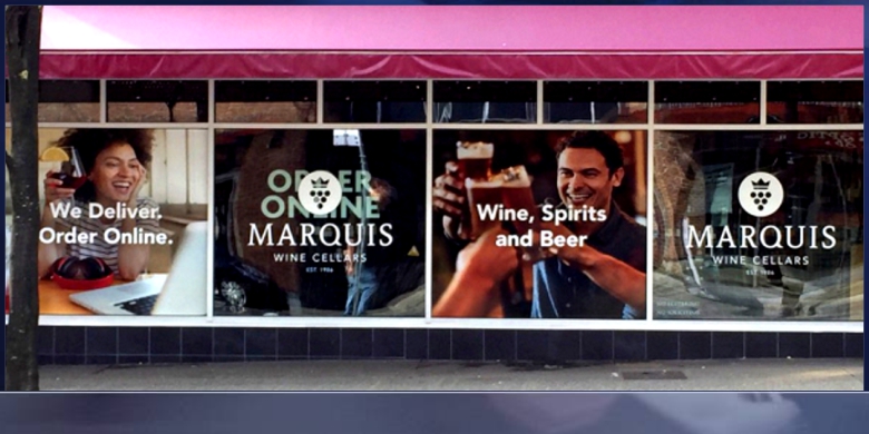
Welcome Them Back... with A Cheer
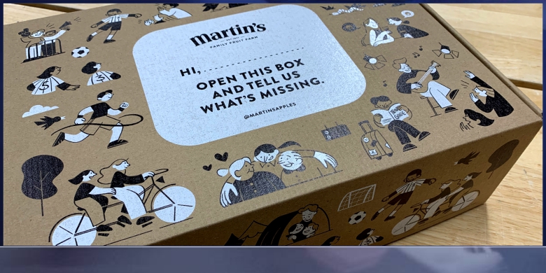
Welcome Them Back... with New Packaging
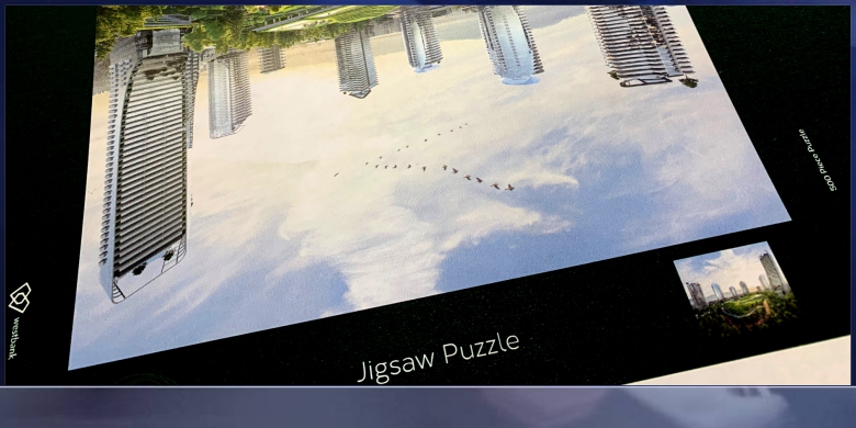
Welcome Them Back... with A Surprise
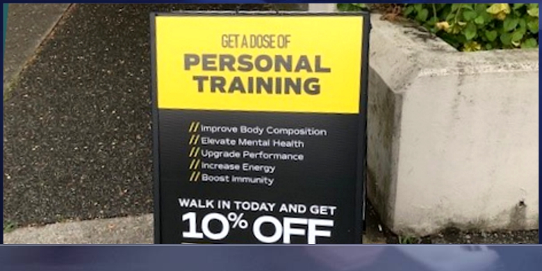
Welcome Them Back... with A Walk In Special
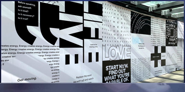
Welcome Them Back... with Your Offer

Welcome Them Back... with Mailed Information
Please contact us for free information, tips and assistance!
In retail environments, brands have just 3 seconds to make an impression on shoppers. Learn how to make sure your products catch buyers’ eyes.
As consumers, we’ve all been there: staring at a shelf fully stocked with dozens of brands’ variations on the product we’re looking for — whether it’s lightbulbs for the guest bathroom, treats for the pup, or bottles of wine for a friend’s housewarming party. It’s overwhelming, isn’t it? Even if we thought we knew exactly what we wanted, the sheer number of options in front of us gives us pause — and the way the products are merchandised may draw our eyes (and our dollars) to a new brand. In fact, research from the Shop Association reports that consumers are exposed to 3,000 promotional messages per day and a whopping 80,000 items in a given grocery store visit. How do we choose?
And more importantly, how do brands ensure their products are the ones that catch our eyes?
It isn’t easy. The same report finds that a consumer’s decision to stick with their go-to brand or buy from a rival takes, at most, seven seconds — and those competing brands have just three seconds to make an impression.
The key to ensuring your brand stands out from the rest? Powerful point-of-purchase (POP) displays. These are the end caps, shelf talkers, display stands, and other types of signage that highlights a brand’s products in order to sell customers on its benefits and value right there in the store. To ensure your brand’s POP / POS displays make your products stand out among those 80,000 competitors, we recommend following these six steps.
1. Speak to Your Audience’s Needs
Consumers generally aren’t looking for products with certain specs or features; they’re looking for products that solve their problems. Maybe that’s eliminating a pain point or making their lives easier in some way; maybe it’s boosting their self-esteem or impressing others or simply adding joy to their lives. As you create your POP / POS signage, and particularly the messaging it conveys, don’t lead with the latest bells and whistles but with the intangible value your product offers customers.
Additionally, be sure to consider the customer’s entire experience. While, ideally, your target audience is already familiar with your brand from your digital, direct mail and other advertising tactics, the shopping trip offers yet another channel to meet and engage with potential buyers during the customer journey. To make your brand stand out, devise ways to engage with consumers from the parking lot into the shelf with branded signage, POP / POS materials, and product coupons.
2. Design for the Specific Retail Location
When you’re creating display materials for multiple outlets — even multiple locations of the same store — remember that not all retail locations are created equal. Retailers will have different rules and guidelines. These guidelines could be based on space constraints. An elaborate floor display that looks beautiful in a large suburban location is likely to be a tripping hazard in a smaller store tucked into a compact, urban area.
Differing rules may also be driven by local laws. No matter how beautiful the design or how powerful the message, a store display that isn’t compliant with regulations is simply a waste of money. Consider working with a marketing supply chain partner that’s well-versed in retail parameters and industry regulations to ensure every piece of in-store signage is compliant and display-ready.
3. Keep Longevity in Mind
A torn-up, worn-out display is a turnoff to customers, so as you design your POP/POS signage, do so with durability in mind. Whether it’s a temporary display for the holiday season or a permanent installation, you’ll want to ensure it looks great as long as you need it to. Will it survive transportation and storage in pristine condition? If it’s a product display will it support the weight of the products? Will it withstand in-store traffic, including shopping cart collisions or purse bumps?
Additionally, you’ll want to ensure the display is easy to restock. Shelf-talkers that get in the way of shelf access or endcaps that are too complicated to easily refill may look great at first, but as product dwindles, they may not get refilled as often as necessary, leading to missed sales opportunities. (Remember, too, that if a display is complex to restock, it’s probably hard for shoppers to access as well and they may pass it by.) A durable, easy-to-maintain display will showcase your brand in its best light for a long time.
4. Ensure Prime Placement in Store
The real estate adage, “location, location, location” applies to in-store signage and displays, too. Once you’ve invested in high-quality, beautifully designed marketing materials, it’s important to ensure those materials are displayed where customers will see them. For example, the Shop Association notes that the sweet spot for signage height is between shoppers’ shoulders and knees. A sign that’s close to the floor isn’t likely to be seen, nor is an in-aisle ceiling dangler.
Also consider unexpected places to grab shoppers’ attention. Research says six in ten in-store purchases are impulse buys, so it may pay to place your displays in strategic places to pique those impulses. Place your products near the cash register to inspire last-minute buys, or near items they pair will with to entice customers. (For example, showcase your salsa on the chip aisle or package your spirits with fun bar accessories and coupons for popular mixers.)
(Note: Make that prime placement easier for everyone involved by ensuring your signage is delivered on time and easy to assemble.)
5. Minimize Production Costs
With tight marketing budgets and high ROI expectations, it’s important to ensure the costs of the POP / POS materials don’t outweigh their value. A savvy marketing partner can help find ways to minimize costs without sacrificing quality or effectiveness. Some of the levers you may pull to streamline costs include material selection, manufacturing techniques and complexity of design. Choosing a partner that gangs orders through “buy windows” and has a proven network of production facilities helps maximize economies of scale, saves costs, and minimizes risk. Knock-down displays — the kind that are shipped disassembled or flat and popped up in store — can save significant costs on packaging and transportation. The more creative you and your partner can be about design, materials, shipping, and ordering windows — without sacrificing quality — the more valuable in-store marketing will be for your brand.
6. Follow Best Practices for POP Display Design
Finally, to create POP / POS materials with maximum impact, be sure to follow the design best practices that are most likely to catch shoppers’ eyes and encourage them to choose your product. Select bold colors that both showcase your brand and evoke the feelings (comfort, safety, impulsiveness, etc.) you want buyers to feel. Select unique shapes that will stand out on shelves and against other displays, and ensure any interactive elements are intuitive for shoppers. Keep your messaging clear, simple, and easy to digest — and be sure your brand logo is on full display. Above all, keep the audience’s needs and experience at the forefront of the design process.
Please contact us for free information, tips and assistance!
Written By: Casey Rush Source: One Touch Point Blog
The psychology of colour is based on the mental and emotional effects colours have on sighted people in all facets of life. Did you know your surroundings may be influencing your emotions and state of mind? Well, there’s a good chance that the colours in those spaces are playing a part.

What is Colour Psychology?
The psychology of colour is based on the mental and emotional effects colours have on sighted people in all facets of life. There are some very subjective pieces to colour psychology as well as some more accepted and proven elements. Keep in mind, that there will also be variations in interpretation, meaning, and perception between different cultures.
Applying Colour Psychology to Everday Life
Did you know your surroundings may be influencing your emotions and state of mind? Do you ever notice that certain places especially irritate you? Or that certain places are especially relaxing and calming? Well, there’s a good chance that the colours in those spaces are playing a part.
In art therapy, colour is often associated with a person’s emotions. Colour may also influence a person’s mental or physical state. For example, studies have shown that some people looking at the colour red resulted in an increased heart rate, which then led to additional adrenaline being pumped into the blood stream.
There are also commonly noted psychological effects of colour as it relates to two main categories: warm and cool. Warm colours – such as red, yellow and orange – can spark a variety of emotions ranging from comfort and warmth to hostility and anger. Cool colours – such as green, blue and purple – often spark feelings of calmness as well as sadness.
The concepts of colour psychology can also be applied in everyday life. For example, maybe you’re planning on re-painting your walls or redecorating a house or room with a new colour scheme. Well, you might want to consider some of these suggestions about colorus and how they might affect your emotions and mood:
Psychological Effects of Cool Colours
Need to be creative? Want help getting those brain synapses firing? Try utilizing the colour purple. Purple utilizes both red and blue to provide a nice balance between stimulation and serenity that is supposed to encourage creativity. Light purple is said to result in a peaceful surrounding, thus relieving tension. These could be great colours for a home or business office.
Are you looking for a peaceful and calming environment? You might consider using green and/or blue. These cool colours are typically considered restful. There is actually a bit of scientific logic applied to this – because the eye focuses the color green directly on the retina, it is said to be less strainful on your eye muscles.
The colour blue is suggested for high-traffic rooms or rooms that you or other people will spend significant amounts of time. Another cool colour, blue is typically a calming and serene colour, said to decrease respiration and lower blood pressure. The bedroom is a great place to use these colours as they should help you relax.
Psychological Effects of Warm Colours
Want to create an environment of stimulation or whet people’s appetite? You might consider utilizing the colours yellow or orange. These colours are often associated with food and can cause your tummy to growl a little. Have you ever wondered why so many restaurants use these colours? Now you know why even after people watched the movie SuperSize Me, they said they were hungry.
You do want to be careful about using bright colours like orange and especially yellow. They reflect more light and excessively stimulate a person’s eyes which can lead to irritation. You also probably don’t want to paint your dining room or kitchen these colours if you’re a calorie-counter.
Pyschology of Colour for Marketing & Advertising
Marketing and advertising are well-known for utilizing colour psychology. The fact that some companies have heavily invested in this type of research and many others have followed through in its use shows they have at enough belief in the concepts of colour psychology to implement them in their advertising.
Colour is consistently used in an attempt to make people hungry, associate a positive or negative tone, encourage trust, feelings of calmness or energy, and countless other ways.
Most marketing and advertising executives will likely agree that there are benefits to understanding and utilizing the psychological effects of colours. Now let’s take a look at some of the more common traits of colour psychology, by some common colours.
The following are some common psychological effects of colours in the Western Hemisphere. Keep in mind that certain shades or tones may result in very different meanings. Also, the context around the colour, and even surrounding colours, can have an effect. Think of this as more of a beginning guide to colour psychology.
Colour Psychology: The Colour White
purity
innocence
cleanliness
sense of space
neutrality
mourning (in some cultures/societies)
Colour Psychology: The Colour Black
authority
power
strength
evil
intelligence
thinning / slimming
death or mourning
Colour Psychology: The Colour Gray
neutral
timeless
practical
Colour Psychology: The Colour Red
love
romance
gentle
warmth
comfort
energy
excitement
intensity
life
blood
Colour Psychology: The Colour Orange
happy
energetic
excitement
enthusiasm
warmth
wealth prosperity
sophistication
change
stimulation
Colour Psychology: The Colour Yellow
happiness
laughter
cheery
warmth
optimism
hunger
intensity
frustration
anger
attention-getting
Colour Psychology: The Colour Green
natural
cool
growth
money
health
envy
tranquility
harmony
calmness
fertility
Colour Psychology: The Colour Blue
calmness
serenity
cold
uncaring
wisdom
loyalty
truth
focused
un-appetizing
Colour Psychology: The Colour Purple
royalty
wealth
sophistication
wisdom
exotic
spiritual
prosperity
respect
mystery
Colour Psychology: The Colour Brown
reliability
stability
friendship
sadness
warmth
comfort
security
natural
organic
mourning (in some cultures/societies)
Colour Psychology: The Colour Pink
romance
love
gentle
calming
agitation
Source: Art Therapy

Construction can be a stressful but highly rewarding profession. We know that currently the construction industry is experiencing some interesting challenges but also more opportunities than in 2020. With that, we'd like to ask Project Managers the following question: Besides the economy and supply shortages, what is it that you are the most worried about?
Are you most worried about getting your materials delivered to you on time? Finishing the project within the time frame? Proper installment and training of your employees and those contracted? The safety of everyone on site? Passing inspections?
We can't wave a magic wand and ensure that your materials will be delivered on time and you'll have the project done before the time is up, but we can help you lay the groundwork to ensure things go as smoothly as possible. Dominion Blue can produce site safety and Covid-19 signage to help protect those working on your site. We can cover the fencing and wood hoarding around the job site to help protect the materials and equipment stored there. Plus, we can print and fabricate a large variety of branded display signage to help with the promotion and marketing side of the project. We can even install the signage.
It doesn’t end there because we’ve taken plan room document management to an entirely new level with our View Share Print Ports, allowing you to manage not only your drawings and specification documents, but also your site signage and marketing materials; All in a secure and powerful online portal which only you and your authorized contractors will have access to. It’s convenient and easy to use.
Please contact us for free information, tips and assistance!
Source: Written By: Dominion Blue
Uber and Lyft drivers are just 1 click away, Amazon offers free same-day delivery, and Deliveroo can get us food from our favorite restaurant in under 32 minutes… Gone are the days in which consumers agreed to invest effort and wait to be served. In a fast-paced world, we look for consumption that is time- and labor-saving.
What matters to consumers is the time and effort they have to expend – the less, the better. ‘Fast’ and ‘easy’ are keywords that should be high on any marketer’s agenda. Take the example of Uber. Its success is not based on a strong emotional connection with customers. What makes the platform so successful is captured by a single word: convenience. Uber’s interface is intuitive and user-friendly. You open the app, type in your destination and immediately receive pricing information. Upon agreement, a driver is immediately connected to you and knows where to pick you up. Reaching your destination, you just get out of the car and Uber charges your credit card automatically.
So, what is convenience then exactly? Academic research by Len Berry and colleagues in the Journal of Marketing suggests that there are five different levels of convenience.
1. Decision Convenience
The first is decision convenience or the time and effort needed to make a purchase/consumption decision. A great example here is Netflix’s recommendation system, driving more than 80 per cent of content watched on the platform. To avoid subscribers getting lost in the vast library, the company goes to great lengths to serve up its content in the most fun and easy way possible. The success is undeniable with Netflix being the dominating streaming platform of the moment.
2. Access Convenience
Second comes access convenience or the time and effort needed to get hold of what is desired. Chinese Hema Fresh puts strong emphasis on this dimension. Being part of Alibaba’s new retail concept, the highly popular grocery chain seeks to integrate the best of offline and online. Hema, among other things, has an in-store on-demand kitchen (just like Whole Foods), is able to deliver any order under 30 minutes within a specified delivery radius (just like Instacart) and sells pre-packaged meal kits to make consumers’ lives easier (just like Hello Fresh). At the basis of this model is a sophisticated and data-driven logistics systems, setting the example for the entire retail industry.
3. Transaction Convenience
Third is transaction convenience or the time and effort needed to pay for products. A prime example here is Amazon that put an easy and transparent payment experience at the core of its business. Its new Amazon Go stores even go further and remove any checkout hassles by automating the payment system, completely eliminating the cashier and waiting lines. The successful concept is set to grow to as many as 3,000 new U.S. stores in the next few years, while also expanding to other countries worldwide.
4. Benefit Convenience
Fourth is benefit convenience or the time and effort needed to consume the product. Consumers today are looking for simple and efficient consumption experiences, allowing them to make the best of their time. The popular navigation app Waze, owned by Google, offers its users such a simple and intuitive user interface, providing highly contextual information like traffic, obstructions and other hazards to minimize travel time. In 2016, Waze partnered up with Dunkin’ Donuts, a U.S. coffeehouse chain, and integrated an ‘Order Ahead’ function. Wazers, as Waze calls its user base, may order coffee within the app and speed past the line when picking up their order inside a DD restaurant.
5. Postbenefit Convenience
Finally comes postbenefit convenience or the time and effort needed to deal with such factors as product maintenance, exchange or failure recovery. One example here is Tesla’s mobile service teams allowing cars to be serviced when and where customers are in need. More recently, the U.S. carmaker introduced an automated service feature allowing Tesla cars to order parts that require replacement on their own. Doing so, Tesla reduces the time needed for car maintenance and proactively prevents any failures.
To successfully interact with today’s hyper-connected and impatient consumers, marketers should be obsessed with delivering ‘fast’ and ‘easy’ solutions to customers. But how?
Regular audits to understand improvement points along the entire customer journey are recommended. A strong customer mindset should be driven by questions like What is it that customers are looking for? How can we further enhance/simplify the customer experience? What levels of convenience matter most? A deep understanding of customers based on solid metrics and a thirst to experiment in search for better customer solutions are key to any organization seeking success. Netflix is well-known for its continuous use of A/B-testing to optimize the platform’s interface. Any major change to the Netflix experience is preceded by extensive testing. Nothing is left to chance.
Artificially intelligent technologies now allow for cost-effective real-time service delivery, 24/7. Despite clear limitations still there, the growing occurrence of chatbots, personal (voice) assistants and humanoids at the service frontline is rapidly making real-time service delivery a minimum requirement to compete on the market. It is imperative for any organization to look into this exciting new world of possibilities and to see where technology can be used to enhance the customer experience. KLM, the Dutch airline, is fueling its customer service with AI to automate over half of all inquiries through Facebook, Messenger, Twitter and WhatsApp. The result? A doubling of its case volume and service agents freeing up time to focus on cases requiring a human approach.
While some marketers would argue this thinking does not apply to their industry, nothing could be more wrong. Take the example of Lemonade. The U.S. insurance platform is rapidly transforming a seemingly rock-solid industry. Their approach? The promise of a zero paperwork and instant everything. Lemonade uses AI to sign up customers and to evaluate claims, boasting it takes a maximum of 3 minutes from approval to payout. The result? A four-year-old startup valued at $2bn.
It is clear, no organization is free from the push toward higher convenience. Time to become ‘fast’ and ‘easy’! The Uber’s and Amazon’s of this planet won’t wait for you to catch up.
Source: EDHEC Vox Written By: Arne De Keyser
We recently completed these presenation boards for Rona's award program. The impact of a simple printed presentation can't be over looked. A personal touch can make all the difference...
"Wow, the new board is perfect. You're service is amazing. I'm a loyal customer forever."
Melissa Awalt
Store Manager
Rona