Our Latest Blogs
Our Solutions News Blog was envisioned to gather and share information from the very best to help you and your business to become more effective.
Our Solutions News Blog was envisioned to gather and share information from the very best to help you and your business to become more effective.
The 50 best golfers of all time. How does one compare Old Tom Morris to Tiger Woods? Ben Hogan to Babe Zaharias? Jack and Arnold to anybody? It's a tough task until you just do the numbers. You can be sure of one thing; their focus on the game was unstoppable. In the same way we here at Dominion have been focused on our game since 1912.
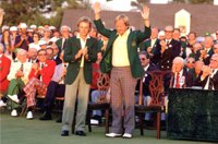 How many professional majors, how many pro tour victories, how many world wide victories even if it's the Legends of Golf or The Skins Game? Those were our measuring sticks. Amateur championships, if added, might change the order a little bit. But that's a task for someone else at another time. These are our top 50 playing in professional events.
The first two slides are for historic golfers who shot scores like 54-56-53=163 to win early British Opens. That's not quite the same challenge as today's players face. However, they beat whoever showed up, and when the winning scores is 163, what was par? Was it just level 4s? It's a wonder we have the records at all.
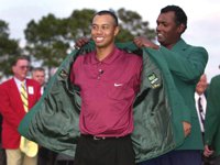 Still, it doesn't make sense to give them higher standing than some of the modern players who contested over 72 holes, on great courses, with tough competition and then won in many tournaments around the world. When you see who the modern era golfers are, you'll understand the reason for putting the historic gentlemen last. No disrespect meant.
Click Here to View the Top 50 Golfers of All Time.
Source: Bleacher Report / bleacherreport.com

The sun is shining and the seawall is already getting crowded, which can only mean one thing—summer is on its way. To further celebrate 100 years of doing business here in Vancouver here's Billboards list of the Top 30 "Summer" songs of all time along with our top summer time printing hits and solutions.
These 30 hot tunes with summer-specific themes are ranked based on each track's performance on the Billboard Hot 100 chart from August 4, 1958—the inception of the chart—through the chart dated May 28, 2011. Songs are ranked based on an inverse point system, with weeks at No. 1 earning the greatest value and weeks at No. 100 earning the least.
Click Here to view and listen to the Top 30. To find out more about ColourWave Printing Click Here, Indoor & Outdoor Signage Click Here, and ProCut Fabrication Click Here.

Johnny Canuck was a Canadian cartoon hero and superhero who was created as a political cartoon in 1869 and was later re-invented, first in 1942, then in 1975.
Johnny Canuck was created as a lumber jack national personification of Canada. He first appeared in early political cartoons dating to 1869 where he was portrayed as a younger cousin of the United States’ Uncle Sam and Britain’s John Bull. Depicted as a wholesome, if simple-minded, fellow in the garb of a habitant, farmer, logger, rancher or soldier, he often resisted the bullying of John Bull or Uncle Sam. For thirty years, he was a staple of editorial cartoonists. Then, in the early twentieth century, he faded from view.
The character re-emerged during World War II in the February 1942 issue of Bell’s Dime Comics No.1. Cartoonist Leo Bachle created the character as a teenager, apparently on a challenge from a Bell executive.
Source: Vancouver Canucks History
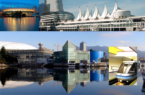
The 1986 World Exposition on Transportation and Communication, or simply Expo '86, was a World's Fair held in Vancouver, British Columbia, Canada from Friday, May 2 until Monday, October 13, 1986. The fair, the theme of which was "Transportation and Communication: World in Motion - World in Touch", coincided with Vancouver's centennial and was held on the north shore of False Creek. It was the second time that Canada held a World's Fair, the first being Expo 67 in Montreal (during the Canadian Centennial). It was also the third World's Fair to be held in the Pacific Northwest in the last 25 years as of 1986 and as of 2012 it still stands as the latest World's Fair to be held in North America.
You'll want to Click Here to take a look back.
The logo of three interlocking rings to make the 86 in the logo stood for the three main modes of transportation; land, air, and water.
Up until the late 1970s, the 173 acre (0.7 km2) site on False Creek, where Expo was staged, was a former CPR rail yard and an industrial wasteland. In 1978, Sam Bawlf (then BC Minister of Recreation and Conservation) proposed an exposition to celebrate Vancouver’s Centennial year (1986). The proposal was submitted in June 1979, for a fair that was to be called “Transpo 86.” In 1980, the British Columbia Legislature passed the Transpo 86 Corporation Act, paving the way for the fair. The transportation theme reflected the city’s role in connecting Canada by rail, its status as a major port and transportation hub, and the role of transportation in communications.
The initial idea was to have “…a modest $80 million transportation exposition that would mark Vancouver’s 100th anniversary.” It soon blossomed into a full exposition thanks to the help of the Vancouver Exposition Commissioner-General at that time, Patrick Reid. The theme of Transportation and Communication led to the conglomeration of many different exhibits of transportation networks. This included a monorail that glided over the crowds that included a trip to every zone. Other ground transports included a Skytrain, a High Speed Surface Transport from Japan, and a French “People Mover.” (basically a little boxcar). The transports of the sky was the Gondola, a boxcar hovering high in the air. The water taxis moved along four different ports on the site.
The fair was awarded to Vancouver by the Bureau of International Expositions in November 1980. However, once it became clear that the event would be a world exposition, the name was officially changed to “Expo 86″ by Ambassador and Commissioner General Patrick Reid in October 1981, and, by the end of the year, Expo 86 Corporation was established as a nonprofit agency responsible in the planning and operation of the fair.
Local business tycoon Jim Pattison was appointed as CEO, and would eventually also become the president of the corporation. The chief architect selected was Bruno Freschi, the Creative Director was Ron Woodall, and Bob Smith was responsible for the production and design.
Construction started in October 1983, when Elizabeth II, Queen of Canada, started a concrete mixer on the future site of the Canada Pavilion, and offered the “invitation to the world.” But, work was disrupted by labour disputes for 5 months. Still, Expo Centre opened May 2, 1985, as a preview centre for the fair.
The fair was originally budgeted for a modest CAN$78 million. However, final expeditures for the expanded event totaled $802 million with a deficit of CAN$311 million.
Expo ’86 was opened by Charles, Prince of Wales, Diana, Princess of Wales, and Prime Minister Brian Mulroney on Friday, May 2, 1986. It featured pavilions from 54 nations and numerous corporations. Expo’s participants were given the opportunity to design their own pavilion or opt for the less expensive Expo module. Each module was approximately two-and-a-half stories high and had the floor space equal to a third of a city block. The design was such that any number of the square modules could be placed together in a variety of shapes. The roof design allowed the interior exhibit space to be uninterrupted by pillars.
Source: Wikipedia
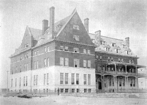
The Canadian Pacific Railway needed a hotel to serve the passengers arriving on their trains at the station located at the foot of Granville Street. T.C. Sorby had designed the station, and he got the job of designing the hotel too. It was up Granville – not too far, but enough to leave some space for new CPR sponsored commercial buildings, and to pull some activity away from the earlier city centre to the east, where there were already plenty of hotels (none of them on CPR land).
Sorby’s hotel opened in mid 1888 to a design that even he didn’t like – complaining of CPR cutting what they considered to be superfluous details – which in those days were what architecture was often about. The CPR were supposedly equally unimpressed – Sir William Van Horne, the CPR President is reported to have said to Sorby “so you’re the damn fool who spoilt the building with all those little windows”. One local newspaper even likened the building’s design to a workhouse. An 1897 newspaper, ‘The Ledge’ published a story which ran “The Vancouver World publishes a long letter from the executive agent of the CPR to the city council, requesting exemption from taxation for buildings proposed to be erected for a passenger station and warehouses. The World publishes cuts of the proposed structures which are said to be in the Queen Anne style of architecture and are fully in keeping with that monument of external ugliness, the company’s hotel Vancouver. The architectural illustrations in the World resemble a compound of a decayed grist-mill with bits of the bastile and the tower of London added.”
Presumably looking for a better response the CPR hired Francis Rattenbury to design the 1893 addition to the south. Rattenbury had only recently arrived in Canada, but at the age of only 25 he had just won the competition for the new parliament buildings in Victoria. In Yorkshire, where he had arrived from, he had been designing buildings in the ‘model’ mill town of Saltaire – or so he told the Vancouver Sun, although actually he hadn’t even been born when that development had taken place. His design for the hotel extension didn’t really have much to do with the original building. Although Sorby’s hotel was identified for replacement as early as 1900 it was still around for a few more years.
Rattenbury was hired to design a further extension to the original in 1901, which he carried out in an Italienate style that isn’t so very different from his design for the city’s new courthouse five years later. Rattenbury fell out with the CPR, but was busy with other projects including the Empress Hotel in Victoria, so in 1910 architects Painter and Swales were hired to replace a much bigger and more elaborate replacement for both the first hotel and the 1893 addition which was eventually finished in 1916.
These days the site has the Cesar Pelli / McCarter and Nairne designed Pacific Centre Mall which is now anticipated to see a major redesign in the near future with Sears having confirmed their intention of leaving later in 2012.
Source: Changing Vancouver
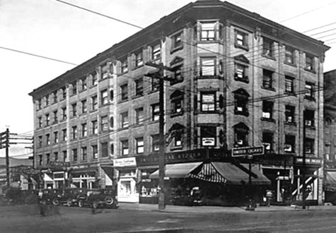
Dr. Simon Tunstall was born in Quebec, in 1852, qualified as a doctor at McGill University and moved to British Columbia in 1881. After practicing in Lytton and Kamloops he moved to Vancouver in 1892 with his wife and family and seems to have gained a favourable reputation which would extend to international recognition; when the American Medical Association met in Boston in 1906 Dr. Tunstall was identified in the Boston press as a ‘distinguished visitor’ of the Association, and he presided at the Canadian Medical Association meeting in Vancouver in 1904.
In March 1902 G.W. Grant obtained a building permit worth $1,600 to build the foundation for a building on Granville Street for Dr. Tunstall, and two months later another permit worth $22,000 to build a ‘stone and brick store’ which was built by D. Saul. In 1909 Dr. Tunstall spent a further $20,000 on adding to the building, Dissette and Dean carrying out the work and Grant again designing the building, by this time in partnership with Henderson.
The image above from 1927 shows the completed building at five storeys. Dr. Tunstall had Grant and Henderson design a house for him on 5th Avenue in 1911, and in 1912 they designed a $42,000 office building for him on Denman Street (although it doesn’t look like it was built).
In the early years of its existence the Tunstall Block’s tenants were (not surprisingly) doctors, including a husband and wife chiropractic team. The building stayed on Granville Street for many years, replaced eventually by the northern block of the Pacific Centre Mall, designed by Zeidler Roberts Partnership and not completed until 1990. In 2007 the corner of the block had a radical redesign by Janson Goldstein of New York for the new Holt Renfrew store, incorporating panels of slumped glass in the design.
Source: Changing Vancouver
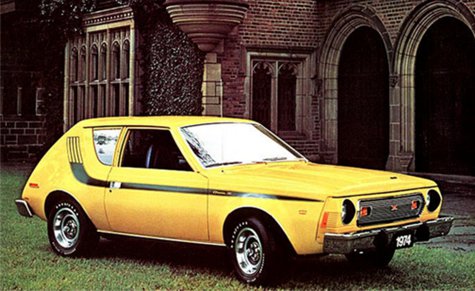
American Motors designer Richard Teague—remember that name—was responsible for some of the coolest cars of the era. The Gremlin wasn't one of them. AMC was profoundly in the weeds at the time, and the Gremlin was the company's attempt to beat Ford and GM to the subcompact punch. To save time and money, Teague's design team basically whacked off the rear of the AMC Hornet with a cleaver. The result was one of the most curiously proportioned cars ever, with a long low snout, long front overhang and a truncated tail, like the tail snapped off a salamander. Cheap and incredibly deprived—with vacuum-operated windshield wipers, no less—the Gremlin was also awful to drive, with a heavy six-cylinder motor and choppy, unhappy handling due to the loss of suspension travel in the back. The Gremlin was quicker than other subcompacts but, alas, that only meant you heard the jeers and laughter that much sooner. You'll want to Click Here to view the other 49.
Source: Time Magazine
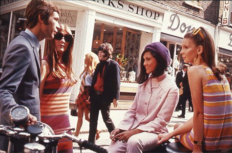
The 1960s featured a number of diverse trends. It was a decade that broke many fashion traditions, mirroring social movements during the period. In the middle of the decade, culottes, box-shaped PVC dresses and go-go boots were popular. The widely popular bikini came into fashion in 1963 after being featured in the musical Beach Party.
Mary Quant invented the mini-skirt, and Jackie Kennedy introduced the pillbox hat, both becoming extremely popular. False eyelashes were worn by women throughout the 1960s, and their hairstyles were a variety of lengths and styles. While focusing on colours and tones, accessories were less of an importance during the sixties. People were dressing in psychedelic prints, highlighter colours, and mismatched patterns. The hippie movement late in the decade also exerted a strong influence on ladies' clothing styles, including bell-bottom jeans, tie-dye, and batik fabrics, as well as paisley prints.
In the early-to-mid-1960s, the London Modernists known as the Mods were shaping and defining popular fashion for young British men while the trends for both sexes changed more frequently than ever before in the history of fashion and would continue to do so throughout the decade.
Designers were producing clothing more suitable for young adults which lead to an increase in interests and sales.
Sources: Wikipedia
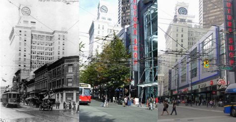
It’s unusual to have three (almost) lined up images, but here’s the east side of Granville Street around 1912 when the new and very impressive Vancouver Block had just been completed, looming over the much smaller two and three storey brick buildings. Faced in terra cotta, the Vancouver Block was designed by Parr and Fee for Dominic Burns who ran the BC arm of the family meat business established by his Alberta-based brother, Patrick. P. Burns & Co which became western Canada’s largest meatpacking company and eventually Burns owned 700,000 acres of ranch land.
Dominic looked after the British Columbia part of the business, and was wealthy enough to fund the $400,000 Vancouver Block in 1910 (with completion in 1912). Dominic moved to the top floor penthouse where he lived until 1933. In the same year the more ornate, and more expensive, Birk’s Block was completed just to the north on the same block, but that was lost in the mid 1970s to make way for the Vancouver Centre. Both buildings had a large number of small companies operating from the building. In the Vancouver Block there were as many as 17 different businesses on one floor. The rest of the block included the Windsor Hotel (later called the Castle Hotel) and the New Orpheum Cafe and Grill, while the building on the corner of Robson was for many years the Royal Bank.
In 2003 a new 3-storey retail store designed by Studio One Architecture was completed, with a top floor Winners store and a Future Shop below it, and a number of smaller retail units on the Granville Street level. The middle picture shows the old version of the transit mall soon after the new retail block was completed; the newly designed street has vertical white low-energy lighting.
Source: Changing Vancouver
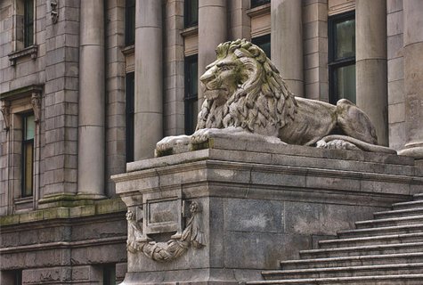
Originally built as Vancouver's courthouse, it was designed by Francis Rattenbury in the classical style. Nelson Island granite was used for the base section and Haddington Island stone for upper levels. The two lions flank what was originally the main entrance were carved by John Bruce — a Scottish artisan who was working in Vancouver, assisted by Tim Bass — from granite from the appropriately named Granite Island near Pender Harbour. They are modeled on London's Trafalgar Square lions by Sire Edwin Landseer. The King Edward VII Memorial Fountain echoes the structure of the main building with its similar pillars and formal structure. The building was completed in 1911.
A 184-foot flagpole, erected in 1912 in the front courtyard--allegedly the tallest in the world--was taken down in 1936 due to safety concerns. The Italian black marble fountain designed by R.H. Savery and sculpted by Count Alex von Svoboda, was opened December 15, 1966, in commemoration of the 1866 union of colonies of Vancouver Island and British Columbia. The building was renovated in 1979-82, by architect Arthur Erickson for its new life as the Vancouver Art Gallery. The original front entrance now remains unused. The gallerys back steps on Robson Street have become a favorite place for Vancouverites to meet, sell their crafts, hold public rallies, or just hang out.
Sources: Vancouver Then and Now