Our Latest Blogs
Our Solutions News Blog was envisioned to gather and share information from the very best to help you and your business to become more effective.
Our Solutions News Blog was envisioned to gather and share information from the very best to help you and your business to become more effective.
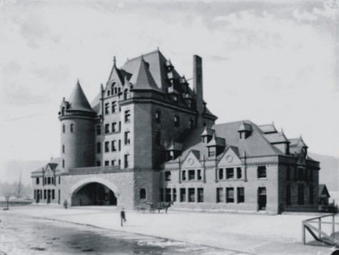
Here's the newly completed CPR station in about 1900. Not T C Sorby's first station that lasted a very short time just over 10 years. This one sat right at the foot of Granville Street, and despite its grandeur it only lasted fifteen years before being replaced by the one still standing today.
The designer was a German immigrant, Edward Colonna (who had changed his name from Klonne when he became a US citizen). Colonna came to CP from designing the interior of rail coaches, and before that working in New York for Louis Comfort Tiffany. On leaving CP in the early 1890s as the railway boom was ending he designed for Maison de l'Art Nouveau in Paris, both jewellery and furniture. He then moved to Toronto, where he worked for 20 years before retiring to Nice where he died, aged 86, having been paralyzed and bedridden for over 20 years.
Colonna's station design was only partly complete when a severe down turn in the economy saw construction halted. The building's final appearance was completed in 1899 by Montreal based (and born) architect Edward Maxwell, who reworked Calonna's design but stayed true to its Gothic style. Indeed for the now demolished Ottawa station he adopted a similar chateau style, and for an economy sized version head to The Keg in New Westminster where Maxwell's $35,000 1899 station can still be found.
Today the site consists of a parkade that's associated with the offices in the replacement station and the office tower at Granville Square built in the 1970s as one of the few completed parts of Project 200, a huge urban renewal scheme that would have seen Gastown swept away.
Source: Changing Vancouver
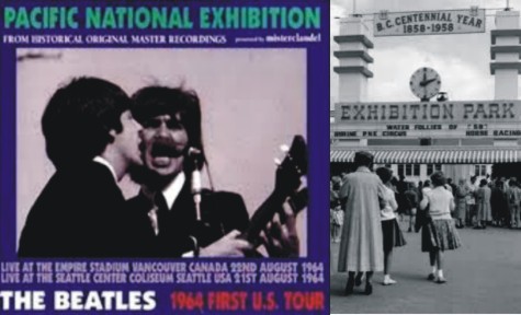
Appropriately enough for a part of the city that was founded on tourism and hotels, the former Hastings Townsite became home to one of the city's biggest attractions.
In 1908, a group of East End realtors got together to plan an exhibition, the precursor to the Pacific National Exhibition (PNE). They wanted to put on a show as impressive as the Royal Agricultural Show in New Westminsterbut that would be within the reach of a five-cent [street]car fare.
With an eye on the 160-acre Hastings Park, used for little more that horse racing since the province had granted it to the city in 1889, they asked both the City of Vancouver and the provincial government for startup funds. The city put a bylaw before voters, asking ratepayers to approve a $25,000 grant, but the voters said no. So did the province.
The premier, Mr. Richard McBride, candidly and frankly told the deputation who waited upon him that the government opposed the movement which it calculated would be destructive to the established Royal Agricultural Society at New Westminster, and that no assistance could be looked for from that quarter, recalled Vancouver Exhibition Association co-founder John James (J.J._ Miller, writing in the 1930s).
Instead the founders turned to private funds to raise the capital they needed to mount their show. Miller, who served as president of the exhibition from 1908 to 1921, bought the first $100 life membership, and co-founders Professor Edward Odlum and George McSpanddenboth East End realtorsbought life memberships numbers two and three. Eventually the co-founderswho also included realtor Thomas Duke and newspaper writer J. Field-Johnsonmanaged to raise $20,000.
A few months later, the city again asked voters to contribute the exhibition, and a bylaw for a $50,000 grant passed.
Money in hand, the exhibition's first board of managementwhich included Charles Woodward, founder of the department storebuilt a handsome show building on 60 acres of parkland leased from the city. Originally called the Exhibition Building, it was later renamed the Industrial Hall, and eventually the Women's Building. Located at what today is the corner of Oxford and Renfrew streets (it was demolished in 1938), it was an impressive looking building with columns, turrets and a half-dome ceiling over the front entrance.
The Exhibition Building opened in September 1910 with so many exhibits entered, organizers had to scramble to get pens for livestock and housed the poultry in a large tent.
Prime Minister Wilfred Laurier opened the fair with a gracious speech of goodwill and good wishes on a beautiful sunny day. A trotting race followed the opening ceremonies, after which Laurier took a walking tour of the exhibit and attended an afternoon tea, presided over by Miller's wife, in a large marquee on the grounds.
Some 68,000 people paid 50 cents each to attend that first exhibition, which tallied up a net profit of $8,825.
This far exceeded the wildest expectations of the promoters, and gave them renewed vigor, hope and encouragement, wrote Miller.
The provincial government did an about-face, with McBride sending a letter conveying his best wishes to the exhibition on its opening daytogether with a cheque for a $10,000 grant.
The Vancouver Exhibition soon rivaled those in Victoria and New Westminster. The latter, contrary to predictions, did not go out of business right away, but lingered until 1930.
Source: Vancouver, Stories of a City by Lisa Smedman
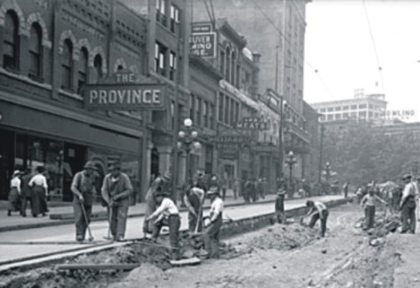
One of the early shop locations for the Dominion Blue Print & Drafting Co. was in the Ormidal Block 151 West Hastings. The 1912 image above shows the back breaking labour it took to install new sewage and roads back then.
A number of buildings on this block were built in the late 1890s, and an original Woodwards store was one of them. The building has been used as an art gallery for many years, but it started life in 1898 as the offices of the Province Newspaper, Walter Nichol's Victoria newspaper that moved into Vancouver and eventually took out Francis Carter-Cotton's rival News-Advertiser in 1924, moving to his smarter offices in the process. In 1926 'The Arcade' a retail centre that may have replaced one of the same name that had been built on Hastings at Cambie in 1894 by Harvey Haddon, originally from Nottingham in England. The Arcade took in the main floor of the Stock Exchange Building next door as well, and was designed by Townley and Matheson. Later it became the National Furniture Store.
Massive changes have occurred on the block in the past few years at one time almost everything was abandoned or so run down that it looked like it would be demolished or converted to housing. However, recent demand for character office space and the impact of the Woodwards redevelopment project have seen clean up and refurbishment of many of the buildings.
Source: Changing Vancouver
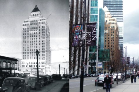
In terms of financial supervision, it may not have helped that the owners, G A Stimson and Co, were based in Toronto when the Marine Building was being built in the extraordinary time of only 16 months from start to finish. The design was local, McCarter and Nairne letting their imaginations run riot on this Mayan influenced deep-sea fantasy, with seahorses, pufferfish (and the odd zeppelin for contemporary reference) in the details. But the budget was blown wide open the cost was over $2.3 million, fifty percent over the original estimate, and if the economy was looking shaky in 1929 when building started it looked positively terrible in 1930 when it opened. So despite the lavish gala when it opened and the beautiful uniformed young women in front of the handmade solid brass elevator doors, nobody was heading upstairs. By 1931 the owners were willing to let the building go at less than half price as a new City Hall.
In 1933 it was knocked down to British Pacific Building Co for $900,000. Fred Taylor, the prime mover of the deal, moved into the penthouse at the top of the building and persuaded the Guinness family to back the investment. Taylor didn't live there much as the elevators closed in the evening, stranding Taylor and his wife on the 19th floor. In the 1940s it became another office space in a consistently popular building for tenants, and the most significant Art Deco masterpiece in the city, and among the best in North America.
When it opened it stood alone on the escarpment, away from the city (which may have contributed to the difficult of leasing it initially). Now its surrounded on all sides by commercial towers, and an even taller one is just being built immediately behind it by Oxford Properties, who own the Marine Building today.
Source: Changing Vancouver
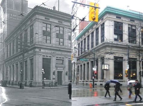
At first glance there's virtually no change between this 1922 shot of a 1915 building, and how it looked in the Vancouver rain. But looking closer, there are differences, and they reflect an evolving role for the building. In 1916 this was the new Merchants Bank, designed by Somervell and Putnam, both Americans who worked in Seattle before Vancouver. For young, recently arrived architects they picked up a remarkable set of important commissions in a very short time, and in turn delivered a set of buildings that are among the best that were built in a fiercely competitive period of growth.
The Merchants Bank was one of many trying to tempt new clients, so the building had to show style while implying solidity. The architects went with a classical theme a temple bank of three storeys (pretending to be two). By 1923 the Bank of Montreal had subsumed the Merchants Bank, and Kenneth Guscotte Rea, their architect, was given the job of doubling the size of the bank, which he achieved almost seamlessly. That's when the doorway disappears the older picture shows the entire building, the contemporary image only half the building.
By the 1990s the Bank of Montreal had no future use for the building, and it sat unwanted, and with an uncertain future. In the early 1990s Joe Segal, Vancouver businessman and property developer bought the building, donated it to Simon Fraser University, and kick-started a restoration fund that raised nearly $20 million to convert the building into the the Segal Graduate School of Business. Extensive and sensitive renovations and restoration, designed by Merrick Architecture, now see the building with a solid future to match its architectural integrity.
Source: Changing Vancouver
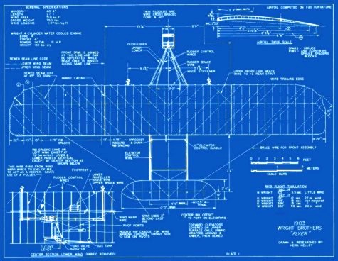
Now of course we didn't print the Wright Brothers blueprints, but it does give you an idea of how long we've been around. As we all know, the Wright brothers were two Americans credited with inventing and building the world's first successful airplane and making the first controlled, powered and sustained heavier-than-air human flight, on December 17, 1903. In the two years afterward, the brothers developed their flying machine into the first practical fixed-wing aircraft. Although not the first to build and fly experimental aircraft, the Wright brothers were the first to invent aircraft controls that made fixed-wing powered flight possible.
The brothers' fundamental breakthrough was their invention of three-axis control, which enabled the pilot to steer the aircraft effectively and to maintain its equilibrium. This method became standard and remains standard on fixed-wing aircraft of all kinds. From the beginning of their aeronautical work, the Wright brothers focused on developing a reliable method of pilot control as the key to solving "the flying problem". This approach differed significantly from other experimenters of the time who put more emphasis on developing powerful engines. Using a small home built wind tunnel, the Wrights also collected more accurate data than any before, enabling them to design and build wings and propellers that were more efficient than any before. Their first U.S. patent, 821,393, did not claim invention of a flying machine, but rather, the invention of a system of aerodynamic control that manipulated a flying machine's surfaces.
They gained the mechanical skills essential for their success by working for years in their shop with printing presses, bicycles, motors, and other machinery. Their work with bicycles in particular influenced their belief that an unstable vehicle like a flying machine could be controlled and balanced with practice. From 1900 until their first powered flights in late 1903, they conducted extensive glider tests that also developed their skills as pilots. Their bicycle shop employee Charlie Taylor became an important part of the team, building their first aircraft engine in close collaboration with the brothers.
The Wright brothers' status as inventors of the airplane has been subject to counter-claims by various parties. Much controversy persists over the many competing claims of early aviators.
Source: Wikipedia
 |
|
 |
|
 |
|
 |
|